Jeffrey Miles Greene
They say that your most difficult client is yourself… or maybe the one you leave for last? I always have struggled with how to promote myself as a freelancer – for many years I wanted to use Viernes Design – but in the end I decided to use my name.
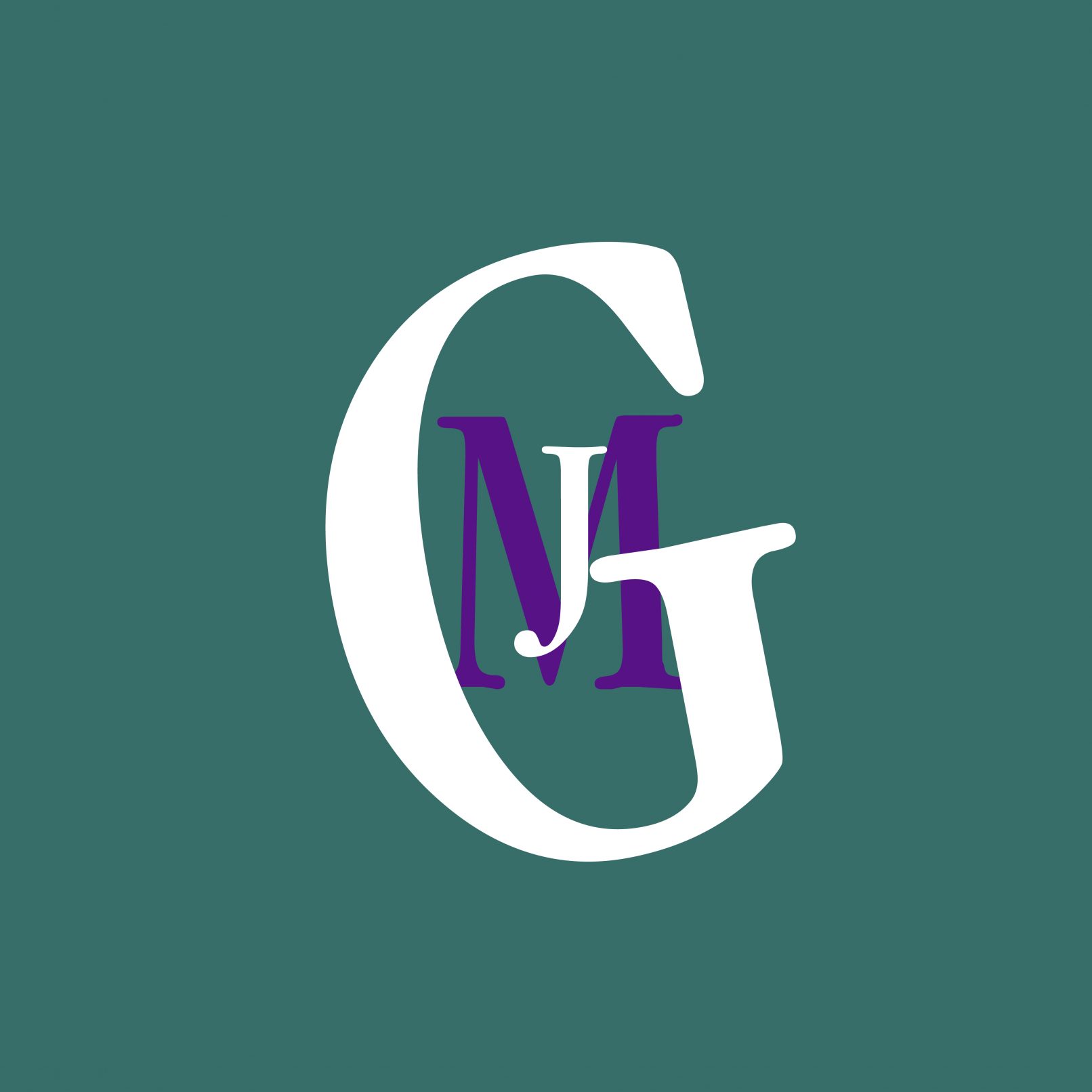
If you know me, the ‘G’ in Greene might look familiar. My father – Henry Miles Greene – started a telemarketing company, ‘Henry M. Greene & Associates’ in the 1980s and his dear friend Ann Stewart (an iconic graphic artist in my book) designed his company logo – a slightly tilted G. I worked the phones for a few summers in high school and college before it was sold in the early 2000s. The logo has still been very much alive on pens, key chains, shirts and guitar picks around the house since then.
In the summer of 2020 my Dad asked me to help him recreate the iconic G to use on a guitar he built. In that exercise I realized that the original G uses the Garamond Nova Condensed Regular font. I was wearing my favorite teeshirt with thick teal and purple stripes… and finally the idea came together! I had used a version of Garamond for Viernes Design and my CV… why not use it for my name and tilt the ‘G’ as a nod to Henry M. Greene & Associates? Thanks for the inspiration Dad! And thanks to both my Mom and Dad for always encouraging me to do what I love…


